A refreshed home for Cool Kids Campaign — built for families, donors, and the team.
coolkidscampaign.org does so much already. This proposal modernizes the design, sharpens the family and donor journeys, and lets the stories you're already telling carry the experience.
- Week engagement
- 8
- Core templates
- 12
- Phases
- 5
- Continuous team
- 1
A focused refresh, built on what already works.
The Cool Kids Campaign mission is exceptional, and nearly two decades of programs, partnerships, and family stories give us a strong foundation to design around.
We'll preserve the regional clubhouse structure, the photography, and the trust signals, and bring everything onto a modern, accessible foundation the team can maintain.
The outcome: clearer family journeys, a smoother donation flow, a consistent visual identity, and a CMS the team enjoys using.
The plan
What we'll keep, what we'll change, and how video carries the story.
Scope
Goals, deliverables, and the family + donor journeys we'll design around.
Discovery
A short questionnaire that helps us tailor scope and design direction to your team.
Timeline
An 8-week plan, phase by phase.
Next steps
Three small actions to start the refresh next Monday.
What we'll keep, what we'll change, and how video carries the story.
Grounded in a hands-on review of the live site as a parent, a donor, and a corporate partner would experience it — focused on the moves that move the numbers.
Build on what already works.
A clear, regional mission
Three clubhouses (MD, NC, TN) give the work obvious physical roots and a tangible reason to give.
Recognizable wordmark
The Cool Kids Campaign lockup and the deep-purple + bright-green palette are already memorable.
Trust signals in place
501(c)(3) status, CFC code 84611, named honorees (Ken Singleton, Dan Jansen), partner logos.
Mature program catalog
Nearly two decades of programming — strong content to design around, not invent from scratch.
Six concrete moves to modernize the experience.
Each move ladders up to the same outcome — more donations, more families served, and less day-to-day work for your team.
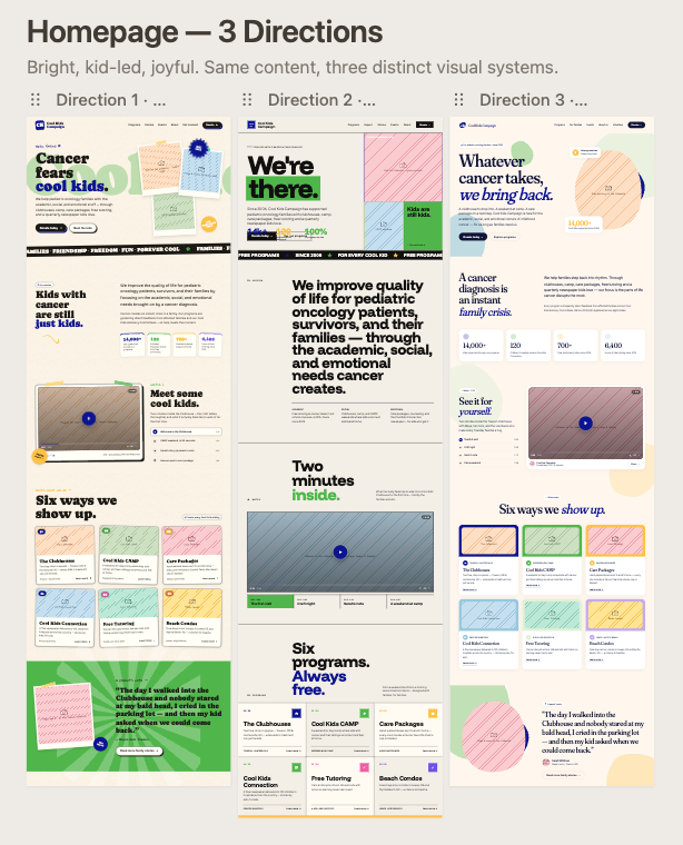
A focused, composed homepage
One primary CTA tied to visitor intent (Donate / Apply / Partner), three audience entry points below, and a hero that uses real family photography with editorial typography — not a stock layout.
A native one-page donation flow
Preset amounts ($25 / $50 / $100 / custom), Apple Pay and Google Pay, recurring opt-in, and an impact statement tied to each amount — no third-party iframe wait.
A web-based family intake
Conditional questions, e-signature, and clinician upload replace the PDF-print-mail flow. PDF stays available as a fallback for clinics that prefer it.
A consistent design system
One canonical wordmark, one nav, a refreshed purple + green palette tuned for accessibility, editorial type, and reusable card / story / CTA components.
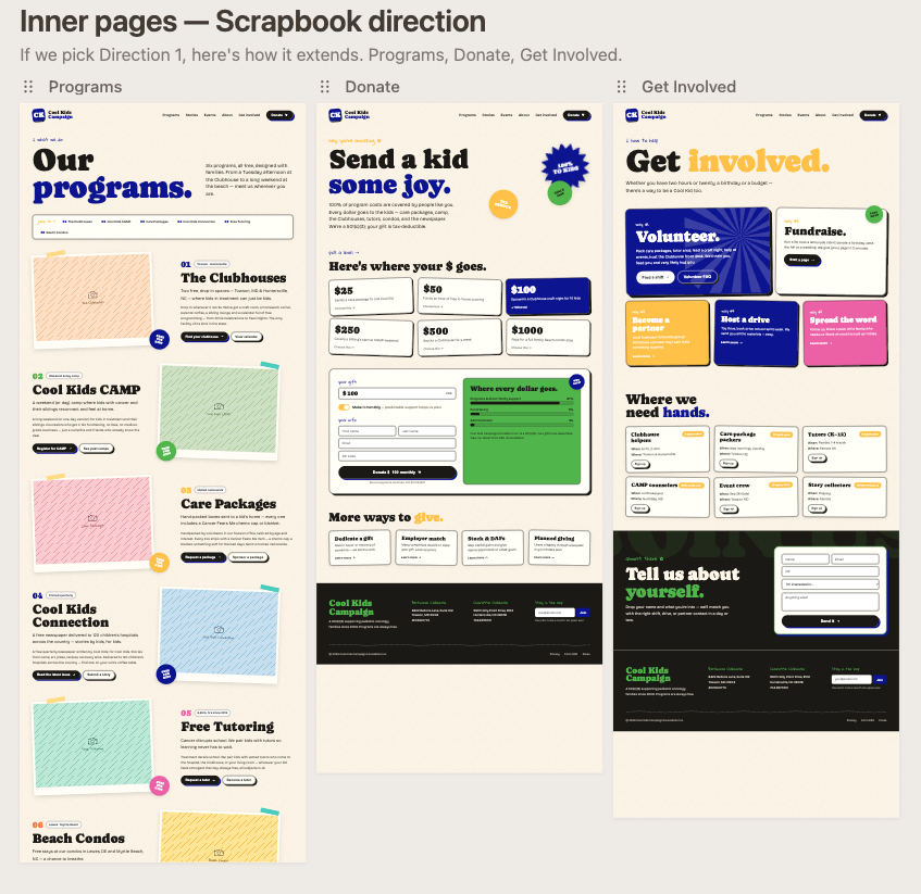
Story-led clubhouse pages
MD, NC, and TN each get a real page: location, programs, upcoming events, named honoree story, and a clear way to give or get involved locally.
Accessibility, SEO & performance
WCAG 2.2 AA contrast, semantic structure, meta and OG tags on every page, image optimization, and a Lighthouse target of 95+ across the board.
Pull video from your YouTube channel into the new site.
You're already producing strong family-story content on @CoolKidsCampaign. The new site treats those videos as a primary storytelling layer woven through the homepage, mission, and clubhouse pages.
An ambient family-story reel
A muted, looping clip from your channel sits behind the hero — real kids, real moments — replacing the static portrait photo.
A featured testimonial video
One curated video from your channel anchors the mission section, with a transcript and a one-line takeaway pulled out as a quote.
Recent uploads, auto-pulled
Each clubhouse page surfaces the latest videos tagged for that location — kept fresh by your team without a developer.
A walkthrough of the current site, area by area.
Notes from a hands-on review of coolkidscampaign.org, paired with the direction we'd take in the refresh.
Overall impression
The current design reads like a mid-2010s template (it looks Avada/Divi-era). The footer copyright still says "© 2022," which signals to visitors that the site isn't actively maintained. Updating that is a quick win regardless of redesign scope.
Header & navigation
The header takes a lot of vertical real estate with two stacked bars (utility bar + logo + nav). We'd consolidate this into a single sticky header — logo left, primary nav center, prominent Donate on the right. The bright purple top bar and lime green nav bar fight each other for attention; a cleaner white or off-white header with brand colors as accents would let the content breathe. The "Become a Cool Kids Family" CTA is important but currently competes with "Donate" — style one as primary (filled) and the other as secondary (outline).
Hero section
The "Our Mission" hero is a simple two-column layout with one photo and a paragraph. For a nonprofit, this is a missed opportunity. We'd recommend a larger, more emotionally resonant hero — a rotating reel or video of kids and families benefiting from the program, a punchy headline ("Supporting the Coolest Kids Fighting Cancer" as the H1 instead of "Our Mission"), a short supporting line, and dual CTAs (Donate / Get Involved). Add an immediate impact statement above the fold.
Color palette & typography
The purple/green/blue trio is recognizable but applied in large flat blocks that feel heavy. We'd soften it with more white space, gradients, or pastel tints for backgrounds, reserving saturated purple/green for buttons and accents. Typography is functional but generic — pairing a warmer rounded display face for headings with a clean modern sans-serif for body would feel friendlier and more contemporary.
Locations cards
The three location cards (Maryland, North Carolina, Tennessee) are a good idea, but the all-green treatment makes them feel repetitive. Give each card a subtle differentiator (a small location icon or state outline), add a short tagline under each, and include a clear "Learn More" or "Visit" button so users know they're clickable.
Stats section
The impact numbers (13,000 kids, 300+ families, 3,000 tutoring hours) are powerful but buried below the fold and visually flat. We'd move these higher on the page, add subtle animated counters that tick up on scroll, and use icons more prominently. This is gold for a nonprofit — lead with it.
Footer
The bright royal blue footer is jarring against the rest of the palette, and the photo collage with the logo in the center feels cluttered. Simplify: a calm dark background, cleaner column layout for the three locations, larger social icons, a newsletter signup (currently missing), and an updated copyright year.
Other recommendations
Audit for mobile responsiveness, accessibility (the green-on-green text in the location cards looks borderline on contrast), and page speed. A sticky donate button on mobile, a stories/testimonials section featuring real Cool Kids families, an upcoming events strip, and a press/media mentions bar would all strengthen credibility and conversions. Given this is a 501(c)(3), shortening the donation flow by one or two clicks will measurably impact giving.
A rough mock of where the redesign could head.
Low-fidelity on purpose — structure first, visual design after discovery. Annotations call out the intent of each block.
- 01
Single sticky header
One consolidated bar — logo, primary nav, and a single donate CTA. No duplicated utility links.
- 02
Hero with video
A punchy headline paired with a featured video from the Cool Kids YouTube channel — families and donors hear the story in their own words.
- 03
Stats strip
Years serving families, kids supported, clubhouses, events — moved up so credibility lands above the fold.
- 04
Clubhouse cards
Maryland, North Carolina, Tennessee — each with a tagline and a clear 'Learn More' button.
- 05
Video gallery
Three featured clips from YouTube — events, family stories, behind the scenes — with a link to the full channel.
- 06
Family stories
Real testimonials from Cool Kids families, with names and photos. The most persuasive content on the page.
- 07
Upcoming events
A scannable strip of next events so returning visitors immediately see what's happening.
- 08
Donate CTA band
A full-width band right before the footer — one clear ask, one button.
The work we'll do, the journeys we'll design, and the outcomes we'll measure.
We've shaped the scope around two primary users — a family seeking support, and a first-time mobile donor.
Five outcomes the refresh has to deliver.
Help families faster
From landing to 'I qualify' in under a minute.
Convert more donors
Reduce donate-flow drop-off by 35% on mobile.
Tell stories better
Editorial templates that center the families.
Empower the team
A CMS staff can update without a developer.
Earn trust
Accessibility, performance and SEO as first-class.
Ten workstreams. One continuous team.
| Brand & design system | Tokens, components, motion guidance |
| Information architecture | Sitemap, navigation, content model |
| Page templates (×12) | Home, region, program, story, donate, etc. |
| Donation experience | One-page checkout w/ impact framing |
| CMS implementation | Headless CMS configured for the team |
| Content migration | Up to 80 pages migrated and re-edited |
| Accessibility & SEO | WCAG 2.2 AA, structured data, meta |
| Analytics & instrumentation | Goals, events, dashboard |
| QA, testing & launch | Cross-browser, cross-device, redirects |
| Training & handoff | 2 sessions + written documentation |
Two journeys we'll obsess over.
A family seeking support
- 1Lands on the home page from a hospital referral
- 2Sees 'For families' as the most prominent path
- 3Reads what the program offers in plain language
- 4Submits a short intake form in under 90 seconds
A first-time donor
- 1Arrives from a Giving Tuesday social post
- 2Sees impact framed in $25 / $50 / $100 increments
- 3Completes donation in 3 taps with Apple Pay
- 4Receives a warm, mobile-friendly receipt
Tell us about the organization so we can tailor the work.
A short questionnaire — about ten minutes — that helps us calibrate scope, design direction, and the kickoff plan to your team specifically.
Eight weeks, end to end.
One team running the engagement end-to-end, with a steady cadence from discovery through launch.
Five phases, one continuous team.
- PHASE 01DiscoveryWeeks 1–2
Stakeholder interviews, analytics review, content inventory, IA workshops.
- PHASE 02DesignWeeks 2–4
Brand refresh, design system, key page templates, prototype reviews.
- PHASE 03BuildWeeks 4–6
Front-end build, CMS configuration, donation flow, accessibility passes.
- PHASE 04ContentWeeks 6–7
Migration of ~80 pages, editorial pass, SEO meta, redirects map.
- PHASE 05LaunchWeek 8
QA, training sessions, soft launch, monitoring, post-launch report.
One fixed fee, no surprises.
Total cost
Design & build
Discovery, design, build, and launch — delivered end to end.
$4,000
Three small things to start the refresh next Monday.
Onboarding stays light — most of week 1 is spent listening to your team and families.
Approve the direction
Confirm the scope and approach in writing. We'll send a short statement of work the same day.
Pick a kickoff week
We can start as early as the Monday after sign-off. Discovery interviews are scheduled in week 1.
Share access
Analytics, current CMS, brand assets, partner logos. We'll send a one-page checklist.
Ready when you are.
Reply to this proposal, or reach out directly. We'll hold a kickoff slot for the next two weeks while you decide.
- chad@happywebco.com
- Proposal valid
- 30 days